
UX recommendations for improved access to content
Our UX designer, Vee Rogacheva, outlines our top ten UX recommendations for improved access to academic content.
Access to academic content is difficult, confusing and inconsistent across the different content platforms. Researchers and learners struggle to navigate the complex ecosystem of tools and platforms available to them and opt for alternative sources like ResearchGate or Open Access journals.
To improve the current user experience publishers will need to work together, making it easier for learners and researchers to access content available to them.
Our 10 UX recommendations explore the access experience for users associated with a library, not individual subscribers. Most of what’s covered here applies to publishers and service providers offering a single-sign-on institutional access option on their platforms. Building on the NISO approved RA21 recommended practices, this blog aims to help publishers navigate the world of access options.
1. Make your platform accessible to all users
Adopt the WCAG 2.0 and 2.1 accessibility standards to ensure your platform caters to the diverse needs of your audience. Excluding users because of poor design is no longer OK. In fact, soon it will be illegal for all public sector services in the EU as a new accessibility regulation comes into force.
Any third-party provider of academic content that delivers services to the UK public sector will soon be subject to new accessibility guidelines as Alistair McNaught explains in his recent post.
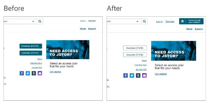
2. Adopt an institutional access button
The Coalition for Seamless Access (previously RA21) recommends the use of a consistent button and icon for institutional access.
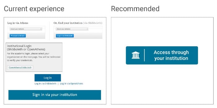
A standard institutional access button will make it easier for users to recognize the access option available to them from one platform to another. Take a look at section 2 of the RA21 UX recommendations for more details.
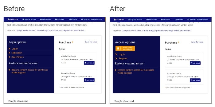
3. Group access options together
Placing access options in close proximity of each other makes it easier for the user to identify their preferred one.
Some publishers offer two or more institutional access options where there are no technical requirements for that. Shibboleth and OpenAthens buttons and links can be replaced with a single technology-agnostic institutional access button.
Where possible, avoid positioning access options below the fold of the page so users don’t have to scroll before they can gain full access to the content they are after.
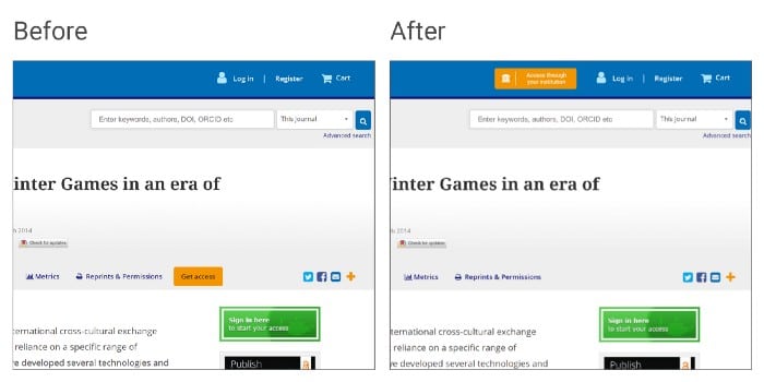
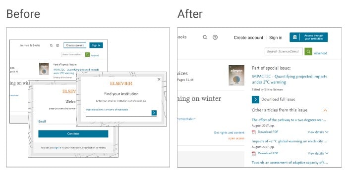
4. Highlight primary access option
Most publishers identify researchers as their primary target audience. Academic and professional researchers can be associated with a library in order to benefit from institutional subscription to a wide range of journals, databases and tools. Yet the institutional login option is often hidden, or confusing.
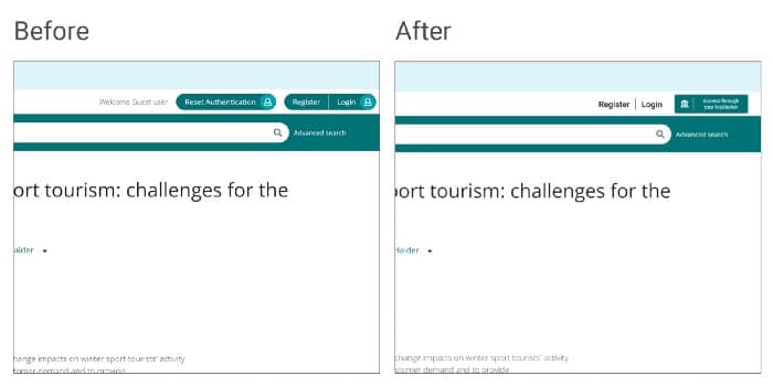
Promoting a paid-for option when most of your users would have legitimate access option available to them is a dark UX pattern.
5. Minimize the steps to access
Every click introduces additional friction, increasing the likelihood of users abandoning the session altogether. The famous one-click buy from Amazon capitalizes on this idea making it really easy to spend money on the platform.
In this example, the institutional access option is difficult to find and adds 3 steps to the log-in process. The institutional access option could be placed alongside other options in the top navigation instead.
6. Adopt a consistent institutional discovery experience
How users find the institution they have an association with varies as much as the login buttons. Consistency here is key so users can complete the search as quickly as possible before they are redirected to their institution for login.
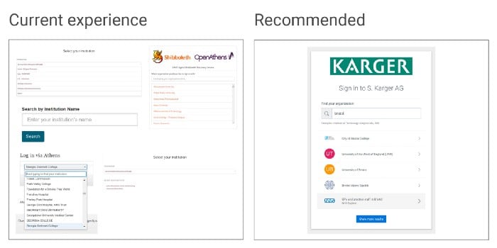
We offer a hosted institutional discovery called Wayfinder for free for all publishers who wish to use it. We also have embedded and overlay versions, which take the user experience to the next level.
Wayfinder will also remember the user’s choice of an institution when they return to the platform.
7. Implement seamless access to title level
Access to title level is also known as deep linking or WAYFless and is needed so users can return to the content page of their interest after authentication instead of being redirected to a home page or other generic page.
8. Offer friendly and helpful error messages.
Things go wrong every now and then and a well-designed content platform takes that into account by providing friendly messages helping users to work out what the next steps are.
Saadia Minhas’ article on How to write good error messages provides great insight into the world of error messages.
9. Test with users before making changes
Usability testing is critical when making changes to established products and services. Doing basic usability tests minimizes the risks and brings light to unknowns early in the project.
Rolf Molich has developed some of the most commonly used usability testing techniques. In an interview for UIE he offers great insight into usability testing best practices.
10. Communicate upcoming changes and give libraries time to prepare
Last but not least, consider the needs of the libraries as an intermediate. Librarians are best placed to communicate and educate your users about the value of scholarly content and how to get access to it.
That requires a well-planned communication campaign combining on platform messaging and library communication.
In summary
So this is it, our 10 UX recommendations for improved access to academic content:
- Make your platform available to all users
- Adopt an institutional access button
- Group access options together
- Highlight primary access option
- Minimize the steps to access
- Adopt a consistent institutional discovery experience
- Implement seamless access to title level
- Offer friendly and helpful error messages
- Test with users before making changes
- Communicate upcoming changes and give libraries time to prepare

Our story
OpenAthens has been providing remote access and authentication solutions for over 25 years. Used worldwide by over 2,600 academic, healthcare, corporate research libraries, publishers, and service providers to provide access to knowledge. We’re based in the UK and are a part of Jisc.